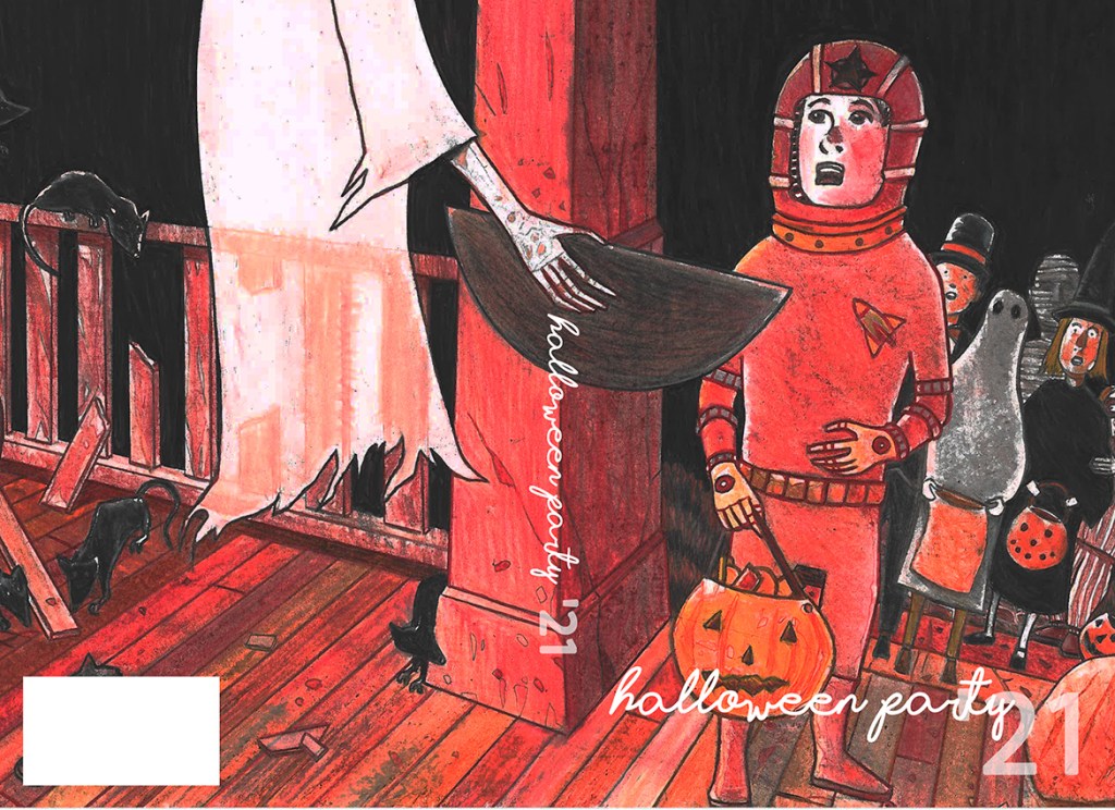
The original, unpublished, cover to Halloween Party ’21.
The 1946 novel, Murder in the Glass Room, is famous for coining the phrase, “You can never tell a book by its cover.” And while this statement has proven true more times than you or I can count, the fact remains that covers and cover design are important aspects of any book regardless of genre or target audience.
Di and I typically collaborate on our covers. Sometimes she’ll come up with the concept, other times I will. By the time all is said and done we’ve done numerous revisions and edits to arrive at what we believe best represents our company/brand as well as our authors, and is likely to capture the attention of the potential buyer.
In the case of HP ’21, I had an idea early on of a porch scene involving a number of children and a ghastly specter. (The original pencils, which I’ll scan and share next time, have even more nasty elements.) As I sketched out the art and began to add colors and texture, I felt fairly confident that the cover would hit the mark. It was only after I completed the page that I realized, almost immediately, that it was wrong for the book. Nevertheless, I scanned the art and imported it into a cover template, but seeing it laid out (the image above) only convinced me further that the art was wrong for HP ’21. Di agreed.
Several aspects of this planned cover troubled me. First, I felt that it was more suited for a young adult or children’s title. It’s not reflective of the seriousness of most of the works found in HP ’21 and I felt it might mislead potential buyers. As well, it’s a big departure from our established house style. Second, I made the mistake of not following the aspect ratio of the cover template. As such, a fair amount of the art on the original board didn’t even make it into the cover template. The back cover, for instance, contains an open coffin with a body inside and lots of rats crawling around it. All lost due to the aspect ratio mismatch. Third, I wanted there to be body parts sticking out the top of the candy bowl. I felt that this element would have given the cover a bit of an edge, but it might just as likely looked silly so it was never incorporated. Lastly, a lot of nuances were lost in the scanning process. I could have redone the scan, but it wouldn’t have resolved the overarching issues.
From a technical perspective I was pleased with the finished product. Having not drawn in ages, I had a number of reservations as to whether I could translate my original sketch into a finished piece. Although I invested a lot of time in the art, I’m not disappointed that we passed on it. What ultimately matters is that the book’s cover is the best it can possibly be. And while I think this cover is okay, I know we made the right decision in passing on it. It’s possible that this art might one day find a home. It’s just not meant to reside with the Halloween Party series.
Speaking of which, if you don’t already own a copy of HP ’21, we strongly recommend purchasing the collection for yourself, which you can find at quality bookstores. Alternatively, and for more immediate gratification, simply click the link below to purchase from Amazon.

One thought on “Natural selection…”
Comments are closed.